
Fonts and colours excite me. I love the challenge of making a word mark that stands for what it represents, and stands out. I love the subtleties and details of logos, and how the elements all fit together, making me think and feel something.
Below is a small selection of some of the work I’ve done over the years.
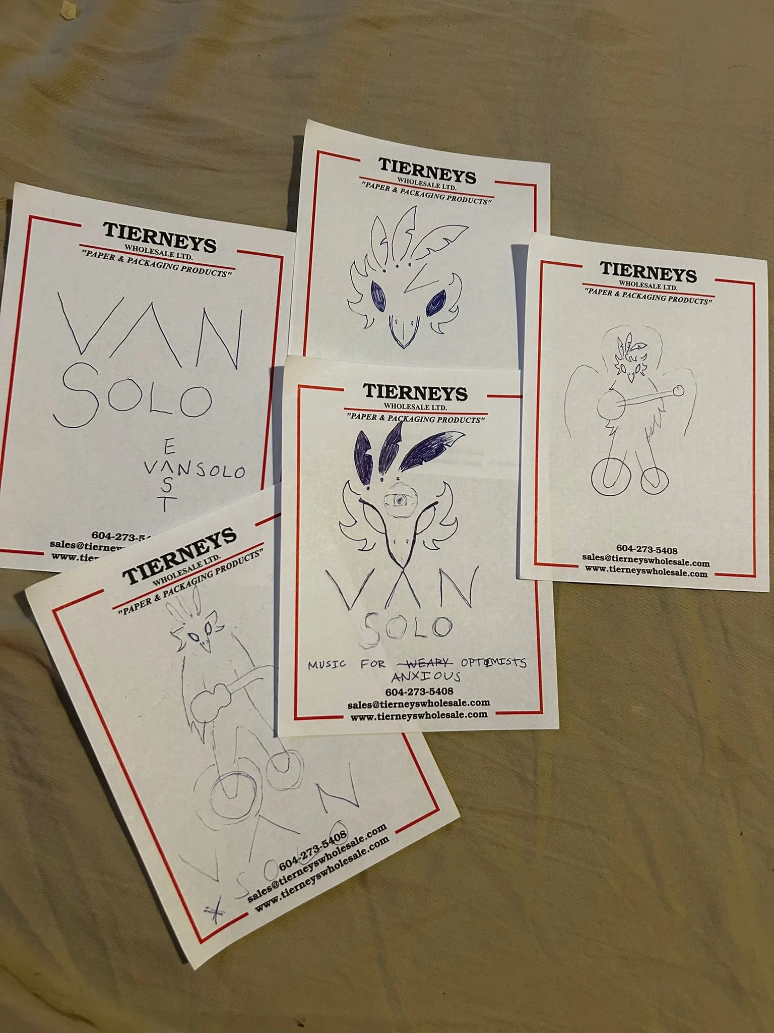
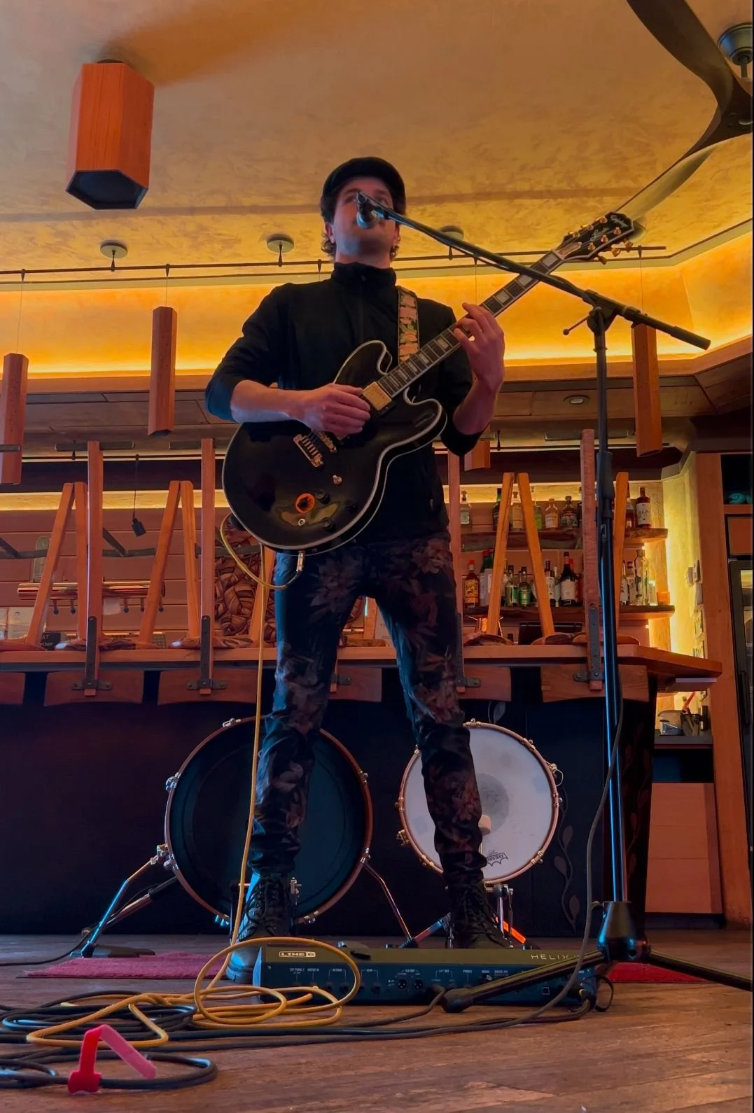
VAN SOLO
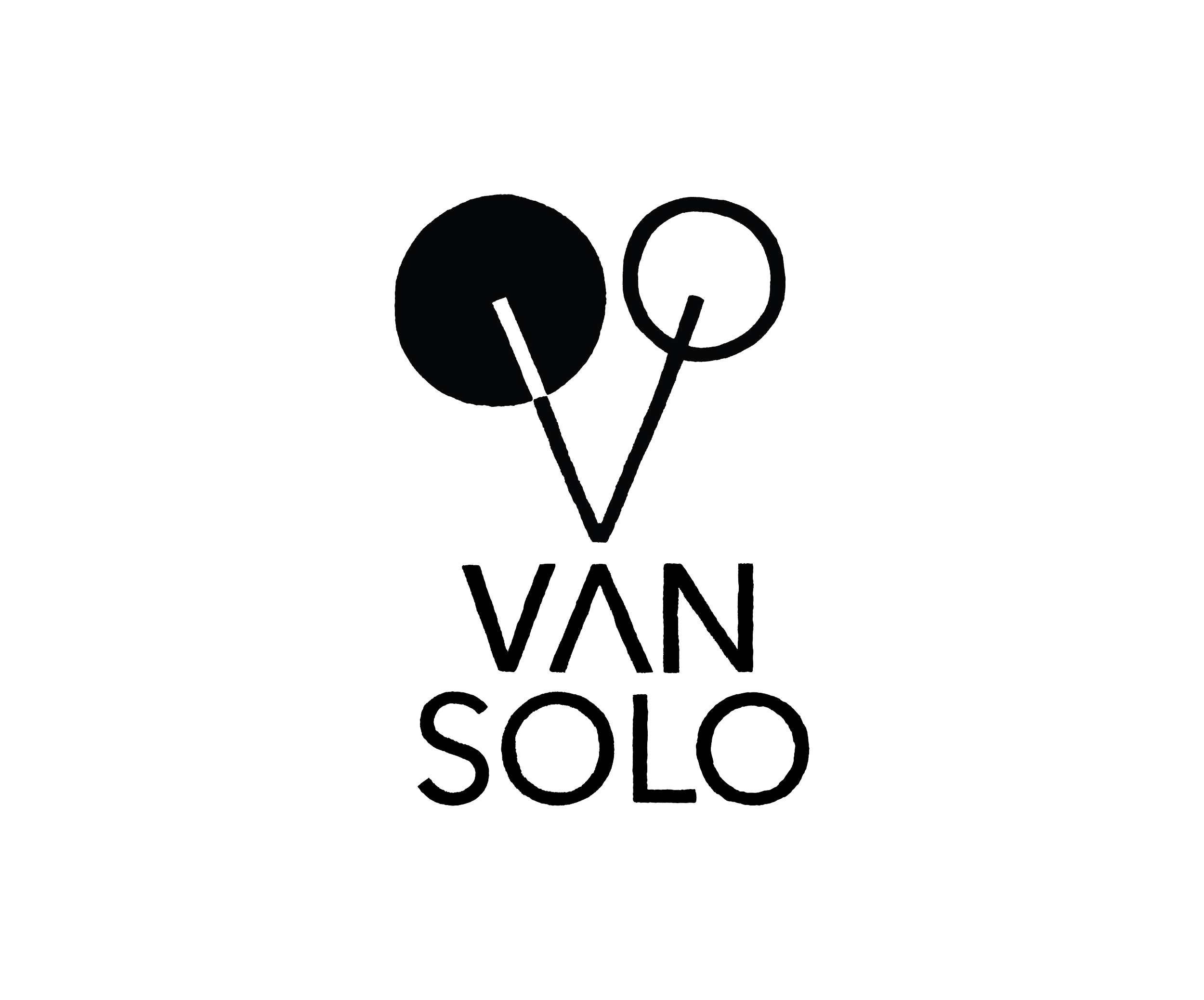

For Van Solo the task was to create a mark incorporating the idea of a bird with the specific drum kit used in his one man show. He came with some sketches and some ideas, and we landed on this primary logo and minimalist bird face which is also the shape of foot pedal drum set.
The font was informed by the logo and done by hand giving it an organic feel. In addition we created a support element of the three feathers, symbolism that was meaningful to the client.
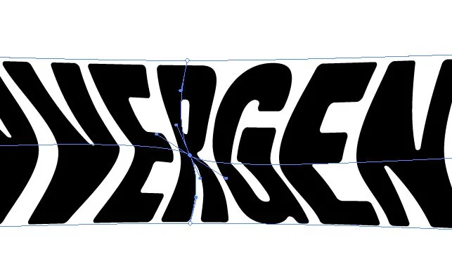
CONVERGENCE FESTIVAL

This multi-year local festival came to me with a rebrand challenge. The task was to integrate the concept of converging, in a font logo. It came as a delightful undertaking, drawing upon several concept inspirations, coming to spring forth with this pairing of bold distorted main font, and the hand drawn sub-title “FESTIVAL”, which I then developed into it’s own unique font set.
The result is this funky, retro inspired and bold mark to immediately convey the concepts within the title.

download Jolly Bean font
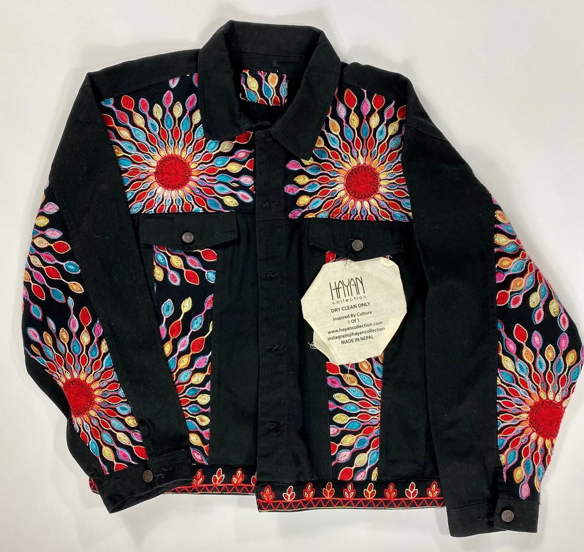
HAYAN COLLECTION
The task to create a brand logo for this eclectic world inspired clothing company was a welcome challenge. The client wanted something that gave a nod to it’s Somali roots and would work well on clothing tags while feeling international.
The result we arrived at is this long legged traveller, which has a very boxy profile, ideal for tags.

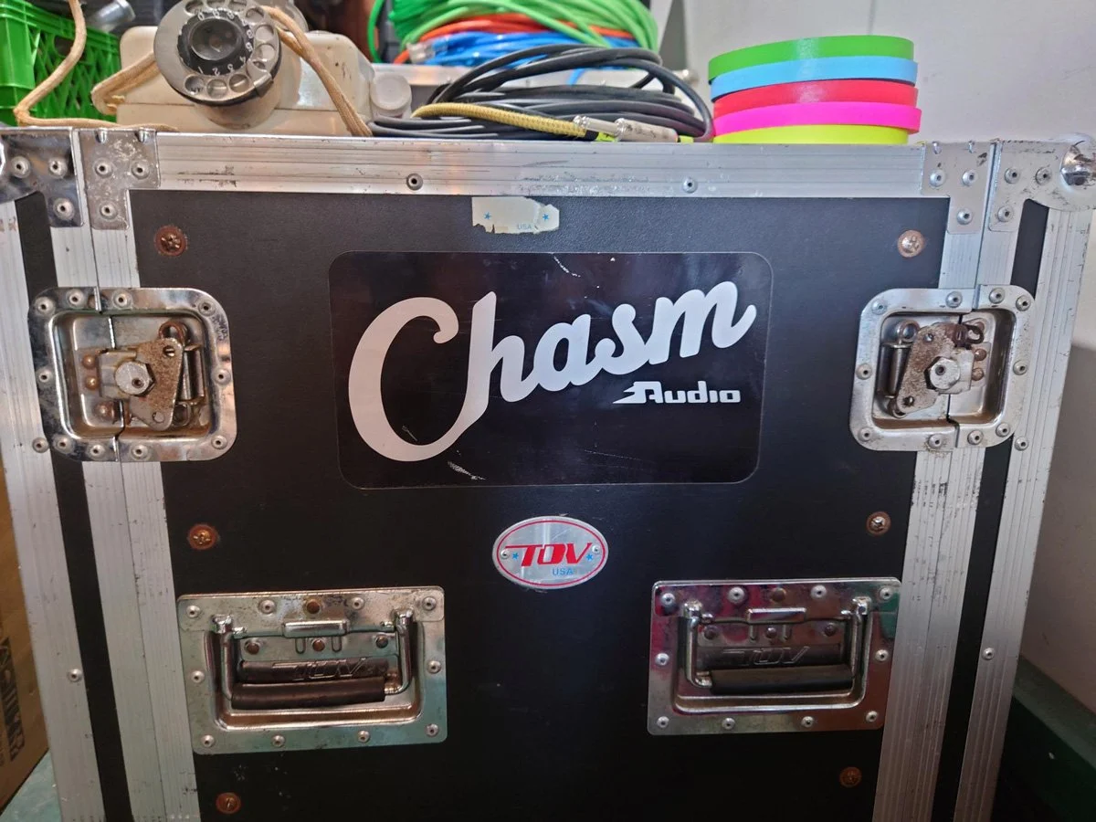
CHASM AUDIO

The client had a very specific vision of a blend between a clean classical stamp logo and an 80’s arcade game, with a timeless feel that you might see in the corner of an amp from the manufacturer.
starting from a basic serif font and fully reworking it into this upward flowing stamp, with a custom built “Audio” nestled underneath.
To further the idea of a Chasm (pr: Kazz-em) we developed a support element of a deep break in the earth which doubles as a representation of the electrification required for the business.
The result being this clean and bold emblem that conveys a number of concurrent ideas.


GAIA FOODS
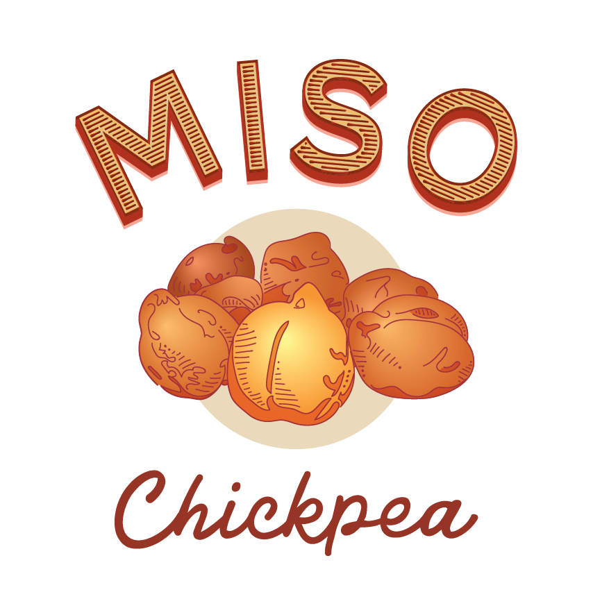
Before I designed a series of miso labels for this client, I first was invited to make a house call and lunch visit to get let in on the level of artistry that they employ for their products. The Koji for this miso, is hand fermented, making it a one of a kind product. They are true masters of creating unique and delicious food items. The visit was wonderful inspiration and gave a keen insight towards the feeling that the labels needed to elicit.


TRUE LOVE PIZZA


This client wanted a fun pizza sticker and hat illustration to add to their existing brand. The challenge was to create something that could be embroidered as well as coloured in for a pop-sticker.
The position and layout were the key components to address for first approvals. I sketched a series of slices of different flavours and we landed on number 8 pepperoni.


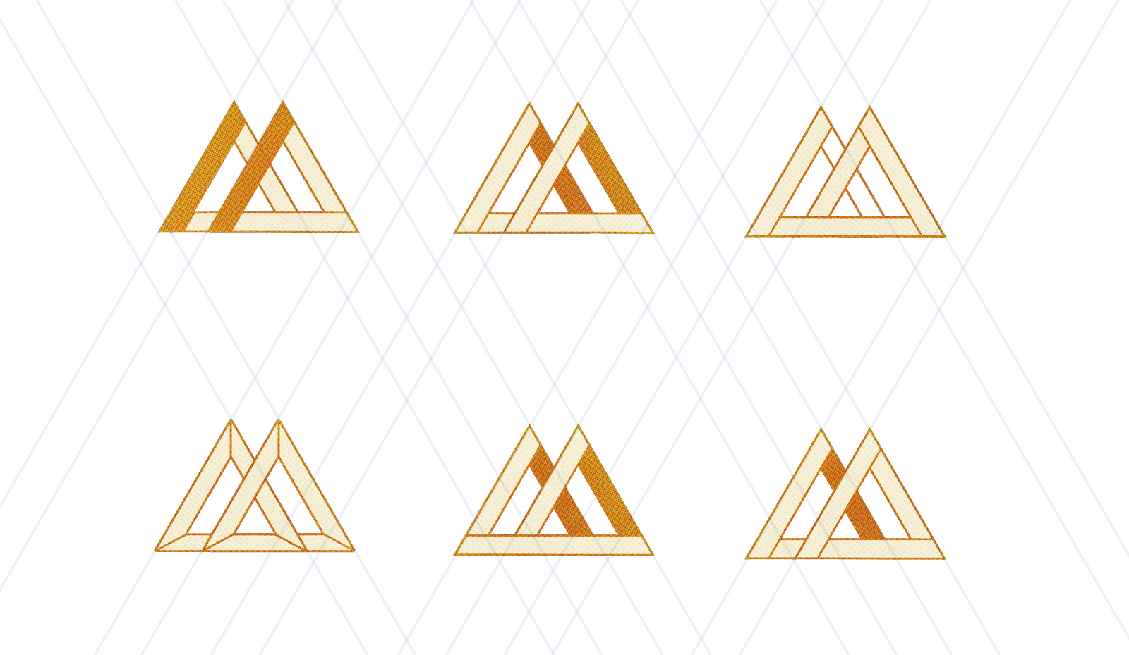
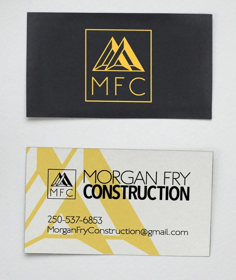
MORGAN FRY CONSTRUCTION
Morgan came to me with the idea that the structures he builds are puzzles. His clients know him to be able to pull off the impossible. He wanted something very structural as well as a letter mark. We played around with many variations of this idea of the M that is also triangles, trusses and beams.
This impossibly constructed shape contains all the letters of his name, though they are not overly accentuated, and tells the story of what Morgan can do.
MICK BROMLEY PAINTING

When Mick saw what I had come up with, he was giddy, he loved it because it was what he spent all his working time immersed in; edges and colours and shapes.
I wanted to create something using simple geometry and lots of colour, and landed here with delight.

